ChessDrop design details
In this article, we share a few design details from our latest product, ChessDrop.
The Makalu team recently launched its third product, ChessDrop, a cloud-based personal chess games database. From the technology stack we chose—React, Meteor & Heroku—to the design process, there’s much I plan to tell you about. But for now, in this brief post, I’d like to whet your appetite with a few of the key design details you’ll find in the product.
(And please pardon some of the UI artifacts from the process of creating animated GIFs.)
Mobile first
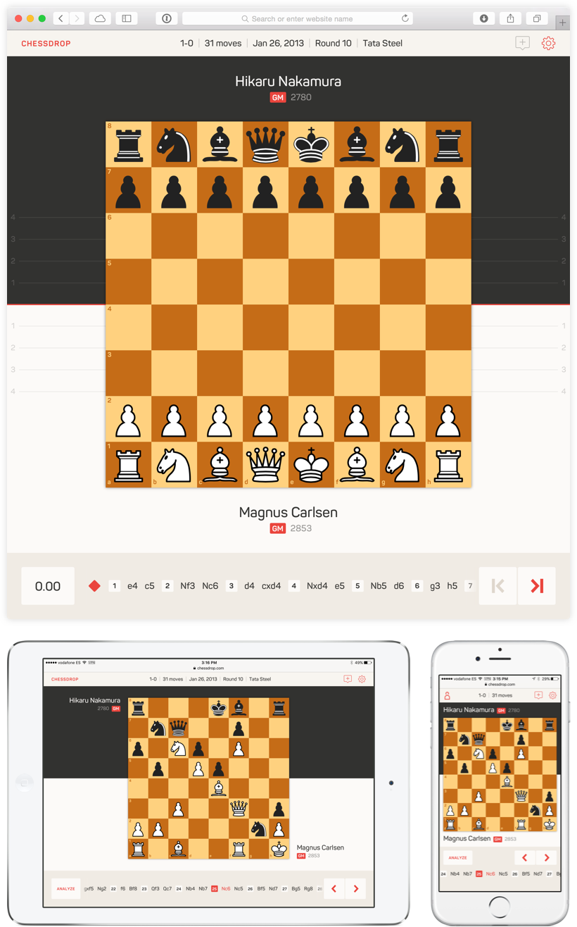
Our aim is for ChessDrop users to enter their games directly while at tournaments, and so designing for mobile was a clear priority. From positioning of the player names, to game move interaction, to thumb-targeted placement of the forward/backward controls, the design and implementation of the user interface to work well in smartphone, tablet and desktop environments was a considerable challenge.

Communicating positional evaluation
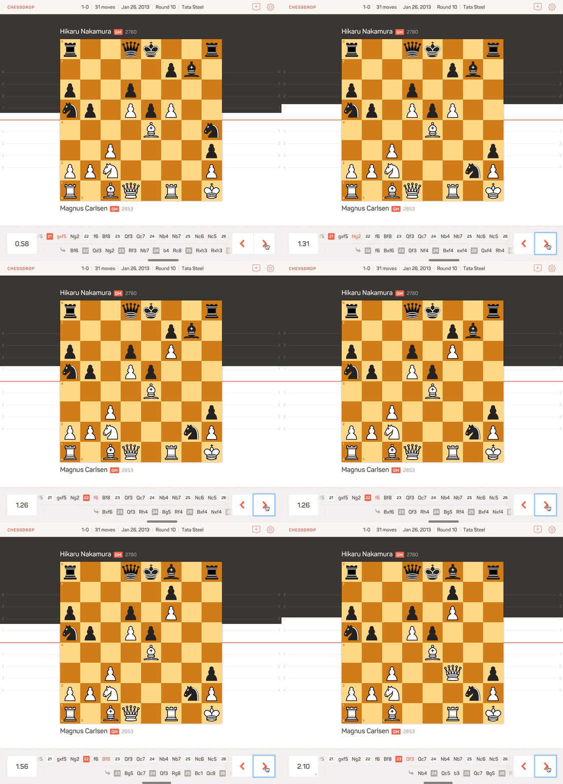
Like many chess products, ChessDrop includes an “engine” that can be used to evaluate the current position on the board. Engines return their evaluations as a positive or negative numbers. Anything between +0.5 and -0.5 is considered nearly equal. An evaluation like +3 or -3, on the other hand, would communicate a winning advantage for white or black, respectively.
In addition to displaying the numerical evaluation, as most products do, we also wanted to communicate the positional evaluation visually, and arrived at a solution which involves dynamically shifting the vertical background color weighting from move to move.

At each point in the game, we also display the move continuation that the chess engine calculates as optimal, just below the actual recorded game moves. The ChessDrop user can tap or click into that continuation to explore it, and then return to the recorded game at any time.
Annotating the game with comments
Chess players, and their trainers, depend on the ability to annotate their recorded games with comments. Most chess products display comments within the textual representation of the game, as you can see in this screenshot from a Mac OS X chess app.

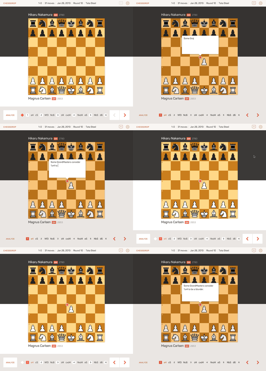
In ChessDrop, we wanted to find an alternative that would allow comment editing and viewing directly in the context of the game board. I think we found an elegant solution.

Game sharing
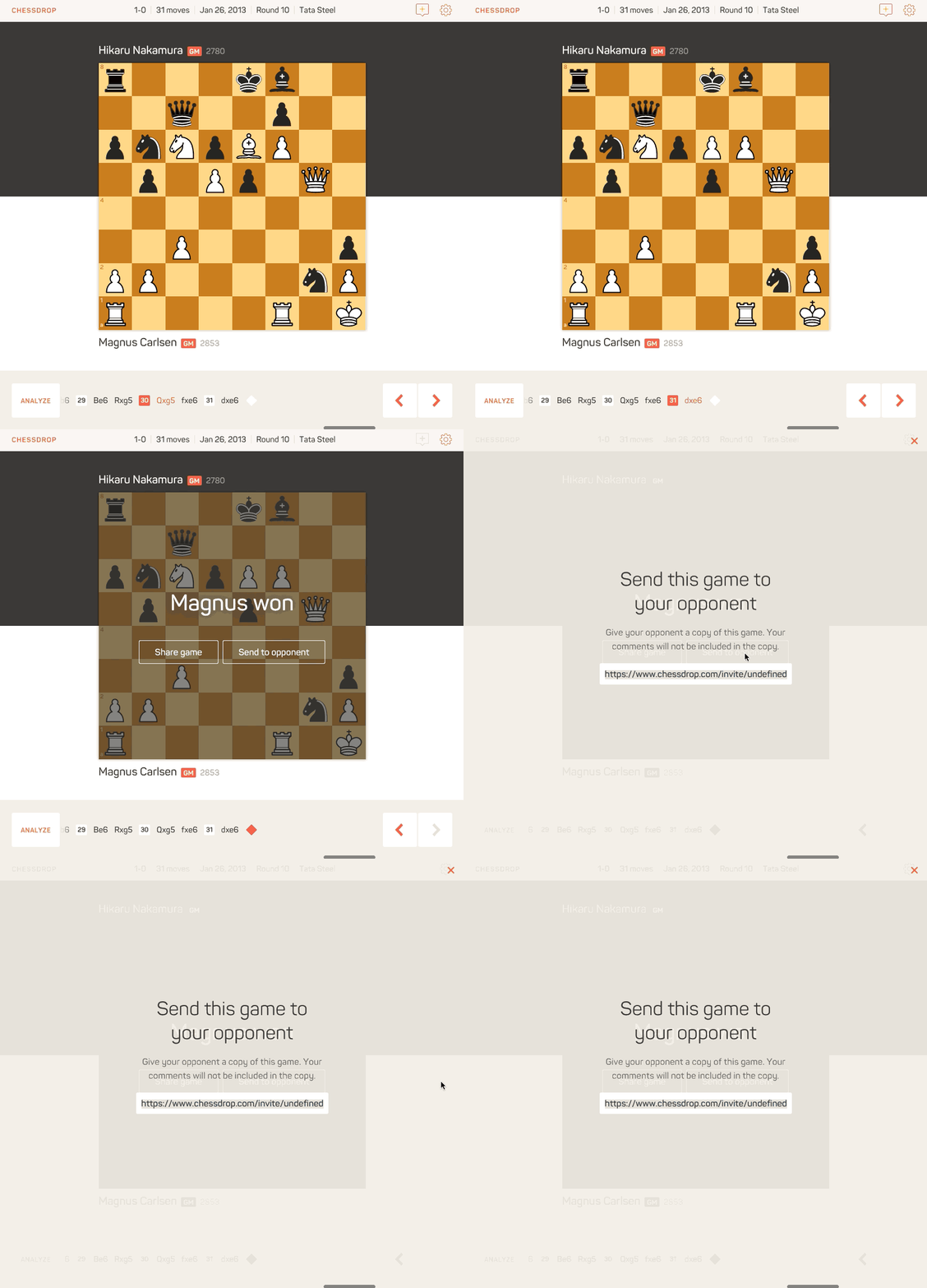
Finally, we wanted to design a closing experience that clearly indicated that the game was over, what the result was, and encourage sharing. As an incentive to share, we allow players who have entered their game in ChessDrop to send their opponent an invitation to add a copy of the game into their own account. In addition to saving the opponent time, we open the door to social interaction within the platform, and help to organically spread the word about the product.

More to come
Designing and building ChessDrop was a tremendously enjoyable process for us, in which we discovered some new design and interaction patterns, and had the opportunity to gain experience with the exciting React+Meteor technology stack. We’ll be publishing more about the experience in the coming weeks, so be sure to follow us on Twitter to be notified when those posts appear.

